#StandWithUkraine - Stop the Russian invasion
Join us and donate. We are contributing all book royalties from 2022 to present to:
Save Life in Ukraine and Ukraine Humanitarian Appeal.
Draw Attention to Meaning
When finalizing your visualizations, add finishing touches to draw attention to the most meaningful aspects of the data. In addition to writing text to accompany your charts and maps, you can also add annotations and use colors inside some types of visualizations to point out what’s most significant in your data story. Let’s demonstrate how to use these features to transform your visualization in Datawrapper, a tool we first introduced in Chapter 6.
One of the environmental challenges we face today is the ever-growing production of plastics. While these inexpensive and lightweight materials offer many quality-of-life benefits, we often deposit them in mismanaged waste streams that cause them to enter our rivers and oceans. To understand the growth of plastics, we consulted Our World In Data, and you can view the annual global production data from 1950-2015 in Google Sheets format.57
First, let’s upload the data in a single-column format to Datawrapper. By default, the tool transforms this time-series data into a line chart, as shown in Figure 15.3, which shows how global plastic production has increased over time.
| year | plastics |
| 1950 |        2 |
| 1951 |        2 |
...
Figure 15.3: The default line chart for historical plastic production in Datawrapper.
But Figure 15.3 does not yet focus on the bigger story: the total amount of plastics manufactured in global history. More than 60 percent of all of the plastics ever manufactured in the world have been made since 2000, or the last 15 years of this chart, according to our analysis of the data. Let’s highlight this broader point by editing the chart and building on skills you learned in prior chapters. First, divide the data into two columns, before 2000 and since 2000, which allows you to apply different colors to each data series. Insert the same data for year 2000 in both columns to make the new chart look continuous. Second, change the chart type from the default line chart to an area chart to fill the space under the curve to draw attention to the total amount of plastics manufactured over time. Third, in the Refine tab, since you do not want a stacked area chart, uncheck the stack areas box. Assign a dark blue color to draw more attention to the post-2000 data series, and a gray color to diminish the appearance of the pre-2000 data series, as shown in Figure 15.4.
| year | before 2000 | since 2000 |
| 1999 |         202 |            |
| 2000 |         213 |        213 |
| 2001 |             |        218 |
...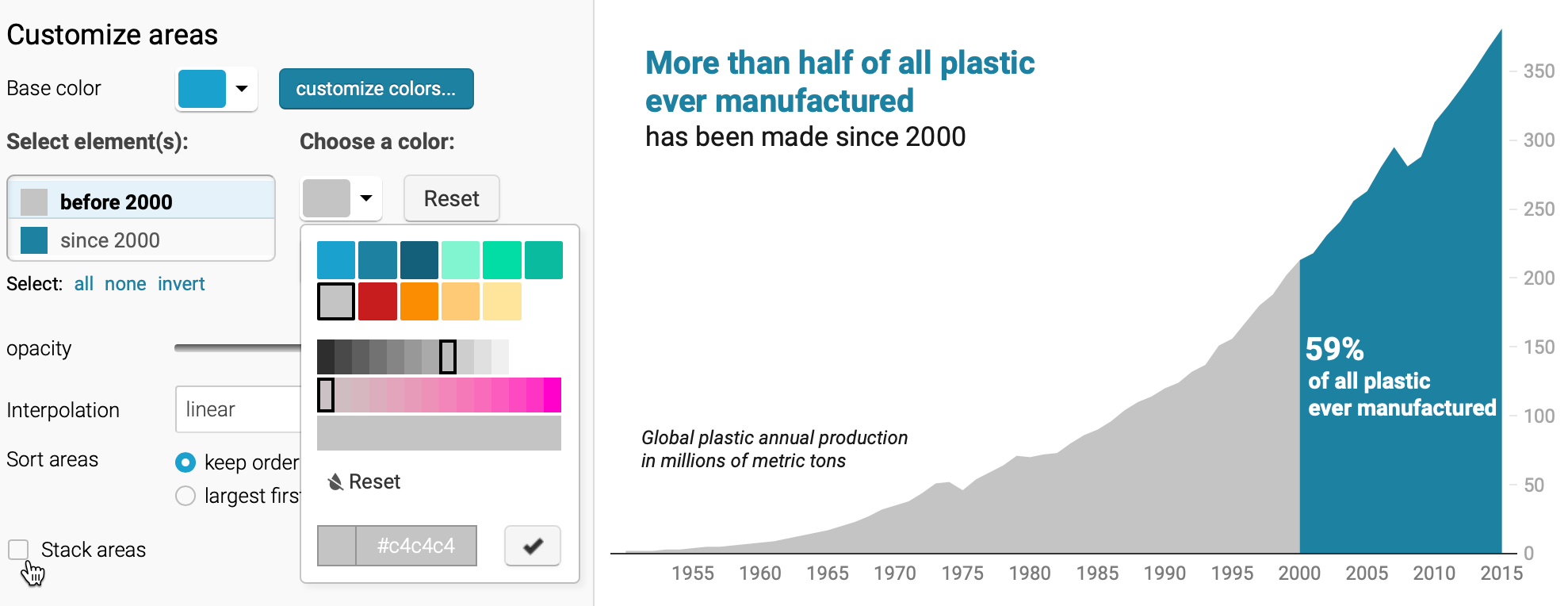
Figure 15.4: After dividing the data into two columns and switching to an area chart, uncheck the stacked areas box in the Refine tab.
Finally, hide the old title and replace it by adding annotations as you learned in the Annotated Charts with Datawrapper section of Chapter 6. Place annotations inside the area chart, using colored text, to emphasize the new interpretation and place it where readers will look, as shown in Figure 15.5. Overall, redesigning your chart helps you to communicate a more meaningful data story that global plastic production is increasing and that our world has manufactured more than half of our historical total in just the past 15 years.
Figure 15.5: Explore the interactive version of the new area chart, which uses color and annotations to draw attention to post-2000 global plastic production.
Now that you have a clearer idea about why and how to draw your audience’s attention to the most meaningful aspects of your data story, we’ll build on those skills in the next section on acknowledging sources and ambiguous data.
This example was inspired by the Datawrapper Academy article on pro tips: https://academy.datawrapper.de/article/256-a-collection-of-datawrapper-pro-tips.↩︎